The following analysis utilizes data presented in:
White, H. and McCain, K. (1998). Visualizing a Discipline: An Author Co-Citation Analysis of Information Science, 1972-1995. Journal of the American Society for Information Science, 49(4):327-355, 1998.
and
White, H., Xia Lin, and McCain, K. (1998). Two Modes of Automated Domain Analysis: Multidimensional Scaling vs. Kohonen Feature Mapping of Information Authors in Structures and Relations in Knowledge Organization, Proce edings 5th Int. ISKO-Conference, Ergon Verlag, Wurzburg, pp. 57-63.

Click on the Figures below
for a full page view.
THE GOAL
To take advantage of the powerful algorithms of spatial (X, Y co-ordinate) processing systems to represent non-spatial data graphically.
Example of graphical display of X, Y coordinate data. Population densities on population totals - Native Americans.
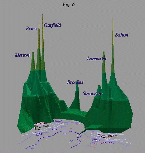
- Fig 6. from White and McCain (p. 350).
"INDSCAL map of 75 'canonical' information science authors" shown as a GIS map (left) (multidimensional scaling by White and McCain using SPSS).
The following maps refer to TABLE 2. "Names, disciplines and institutions of 120 authors in information science" (p. 333, W & M). Data (on only the canonical 75 authors) is assigned to the map from Fig 6.
- Authors by Discipline
Of the total 120 authors, the forty Library and Information Scientists dominate - this is evident in this display of the canonical 75
Note the cluster of sociologists on the left and the History of Science/Science Studies group (green) above them.
Compare this with a black and white symbol version.
- Location of authors
Contour lines reflect demographic connections between the canonical 75, derived from the Institution field data in TABLE 2.
The yellow contours identify non-North Americans. The key, to the left, identifies Americans by state e.g. "OH N E Central" (Ohio-NE Central)
- Authors by American region
This divides the American authors into Pacific, Central, Atlantic and New England.
Business = Companies which have not been identified with any particular region.
- Fig. 1. from White and McCain (p. 340)
"Differences in mean co-citation of 120 authors over two periods." Here showing the canonical 75 authors mapped to the positions identified in Fig 6. and extruded to bar charts. Yellow shows negative change.
Price and Garfield are at the top left, for example, while Borgman and Bates are prominent to the bottom right.
The following maps utilize data from TABLE 4. "Mean co-citation counts for 120 authors in information science" (page 339 M & W)
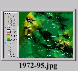
- The full 1972-95 citation data color ramped elevation surface
Showing the canonical 75 mapped to positions from Fig 6. With mean co-citation counts from the full period (1972-1995) as elevation data. Note Garfield (top left) and Salton (bottom right) with the highest mean co-citation counts.
This display shows the data extended to a smooth surface via, first, points, then contours, then a Triangulated Irregular Network (TIN).
- The 1972-1979 data
Color of contour lines (left) reflect connectivity by citation count. Points reflect the same data and are color ramped (coded) on the same scale. The bulk of citations are in the "Garfield camp."
- The 1980-1987 data
Notice for example the decrease in Brookes' neighborhood (top) and the increase in the presence of such authors as L.C. Smith.
- I - Comparing 1972-79 to 1980-87
This reflects the difference between the two periods with the assumption that citations will increase with time (i.e., the 72/79 data deducted from the 80/87 data) - however some changes are negative.
Notice the emergent cluster of Cochrane, Williams, Taylor, Meadows, Svenonius, Marcus, Oddy et al at the bottom right.
- The 1988-1995 data
Note Borgman and Bates at the bottom, Saracevic (near Salton) and Pao top center.
- II - Comparing 1980-87 to 1988-95
Net change between the two periods, 80/87 and 88/95.
Make a note of the grey area to the left with Paisley and Allen.
- III a - Comparing I & II
Treating the two comparisons (I & II) as periods, the earlier is added to the later. Authors who improved in II compared to I show more prominently in this map than in the 1972-95 map, above.
Simon, Pao, and Belkin show more prominently here than in the 1972-95 map, while, for example, Brookes and Merton show less prominently.
- III b - Comparing I & II
Treating the two comparisons (I & II) as periods, the earlier is deducted from the later. This reflects only degree of improvement - even the most cited author(s) will be in the green depressions if they didn't perform better in the second period (II) than the first (I).
Emerging paradigms?
- Spheres of influence
Comparing the output of the Kohonen feature map method shown in Fig 2. of White, Lin, and McCain, to a spatial method of classifying the (canonical 75 only) authors in information science. The method on the left grows "spheres of influence" according to mean co-citation counts (1972-95), in a simple clustering method.
The caveat here is that this method reflects the current state of citation. Just because citation wains doesn't mean the field of study either "splinters" - or ceases to exist.
Just for fun. This is the 1972-95 data extruded in 3D and projected as contours below. The bridge formed by Kochen, Pao, and Smith in the middle.

A screen shot of a virtual reality (VRML) version of the same data.


